
FUTURES FOR EDUCATORS
Responsive Website Design
"It’s not enough that we build products that function, that are understandable and usable, we also need to build products that bring joy and excitement, pleasure and fun, and yes, beauty to people’s lives.”
Don Norman

FUTURES
FOR EDUCATORS

It's Yours To Make

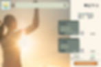
Users name or Email
Password
Forgot password?
Sign in with Google
Looking for your future? Sign up!
FUTURES
FOR
EDUCATORS
Welcome!


FUTURES
FOR
EDUCATORS

It's Yours To Make
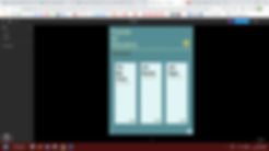
Home Information Education Conversation Coaching Opportunities Account

Education is a fantastic
profession!
But have you been thinking about making a change?
Futures for Educators can guide you in making that decision with almost everything you need to know.
The Beginning and the End
It's been said that teachers in the United States are leaving their jobs in droves - the end of one thing is the beginning of something else.
I'm a former educator, and when I decided to change careers, I wanted to pursue a new professional avenue as an informed adventurer.
I discovered quite a few websites with great advice. In fact, there was so much information, it was overwhelming.
My passion for creating order out of chaos took over, and I created the Futures for Educators responsive website. It includes great information to support teachers, and a comprehensive list of websites made specifically to support educators seeking new career paths.
I did quite a bit of research for the site, some of which I will show you here.
This case study, however, focusses mostly on design - the beauty and excitement that Don Norman talks about.
Some Background
My initial user research consisted first of conducting a screening survey to locate interview participants.
At the beginning of this research, I spoke with several former educators to gage their response to my ideas for the website.
Here are a few of the questions I asked them:
1. What is your goal once you leave your teaching position?
2. What educator skill sets do you think would apply to other employment positions?
3. What are some ideas you have about other career opportunities?
4. Do you have plans to get further education? If so, in what areas?
5. On which platform would you most likely use an employment app for educators? (Mobile or Desktop)
6. What kinds of information would you want to find on an employment app for educators?
7. How often do you think you might use this kind of application?
8. What would be important elements to include on a website for teachers changing careers?
9. What concerns you the most about changing careers from teaching?
10. How would you feel about changing careers if you knew there was a centralised website available?
Let's take a look at some of the responses:
Here's how I then summarised their personalities and their goals:


Xander is a high school science teacher who needs an app that provides a wide variety of information on transitioning to a career outside of education because he wants to use his teaching skills and science knowledge in the oil and gas industry.

Lisa is an ELA middle school teacher and wants an app that can help her
find reliable legal advice to leave her job because she plans on leaving teaching
in the middle of the school year.
A theoretical look at their user journeys
on the Futures for Educators website


Putting Ideas Together
I researched the competition since this was the original impetus for creating Futures for Educators.
.png)

My objective:
Create a responsive website that is well-organised, up-to-date, easily navigable with a unique user interface that helps to create an emotionally satisfying visual and interactional experience.
An idea for the framework, and the user journey:
Home
.png)
1
2
3
4
5
6
7
8
9
10
11
12
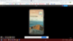
Prototyping
The user flows for each platform are below.
.png)
Now for some user interface design experimentation . . .
.png)


This is more like it . . .


Title 1
Title 2
Subtitle 1
Subtitle 2
Normal content 1
Normal content 2
Thinking About Design
I chose this design style because I wanted something different than what I had seen on other websites. Some of them were beautiful, but I wanted a warmth to come through as well as a feeling of spaciousness.
I have sought balance, in spite of the amount of information I’ve included on the site.


The actual framework of the site is set to include all of the topics that I found on other websites, and then some.
A drawback common to almost all of the other websites was not keeping blogs or news up-to-date.
In addition, for sites with a lot of different components, there was often a feeling of clutter.
Continued monitoring and user testing will help me to make necessary corrections in the future to mitigate the above challenges.
TAKEAWAYS
Good design is not easy. It’s in the details – every line or corner or colour or icon must be lined up, in sync with, pointing intentionally at another element on the screen. It looks simple, but there’s a lot more that goes in to making an attractive interface.
Beautiful, functional design is a lifelong journey in perfection.
